Hello again, battered and beaten reader. I hope hell week has not left you with too many bruises and you’re still well enough to read all the articles we have for you this issue. As always, I would like to start off by thanking you for opening the paper and reading what our writers and contributors had to say. Many hours go into writing these articles and preparing the layout for publication, so seeing all of you clear the newspaper racks is quite encouraging!
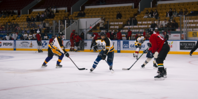
In this issue, we bring you many longer, richer articles than we have in previous issues this term. Noah’s article this week discusses the barefoot running phenomenon, and brings new light onto an often unknown and misunderstood sport. I would highly recommend reading it if you are interested in working on your cardio while providing yourself a challenge to improve your lower body posture and strength.
Bill C-38 passed in the House of Commons a couple days before this issue was prepared, and did not pass without controversy or heavy opposition. Our world news writer Filzah contributed her article discussing the topic to Engineers Without Borders this issue, so you can read her opinions and thoughts on the democratic process in Canada and the hive mind of political parties.
Hannah and Anjali wrote the Point Counterpoint for this week, discussing the University’s decision to not choose the Access Copyright deal that threatened to raise our student fees by at least $20. I would like to thank the both of them for writing these long opinion pieces, and a special mention for Hannah for writing the unpopular opinion for the second time this term.
I had the pleasure of meeting Mark Goody, head of the Outreach division of UWAFT, to discuss the team’s performance in Hollywood last May. While I was unable to write the article following up on the interview, Alison was able to complete it very competently, so read her article about it to learn about the team and research further online if you are interested. The team does some really awesome work with hydrogen fuel cells and hybrids, so definitely give them a look.
One of the things I have been working on recently has been a consistent design and visual identity for The Iron Warrior and its various documents and social identities. Much of this centres around fonts and sizes, applications we use and procedures that are designed to save time. Some attempts at convergence are noticeable in our letterhead and rate card, which now make heavy use of Myriad Pro Semibold, Myriad Pro Regular, and Adobe Garamond Pro for titles, subtitles, and body text, respectively.
In the print edition, the supporting sans-serif text is all now Bitstream Vera Sans, which is the same font we used for our masthead on page 2 historically. This also removes Arial from the print edition, which both streamlines the number of fonts we’ve been using and gets rid of a bland, ugly font. This leaves us with Myriad Pro Semibold for titles and the inside window on the cover page, Myriad Pro Regular for subheadings, Bitstream Vera Sans for the bylines and other supporting text, Adobe Garamond Pro in the sudoku, and the tried-and-true Times New Roman in the body text.
There’s still work to be done to improve layout, as always, but I think this issue acts as a good point of progress. We have also refreshed the icons on the top of the pages, which may go under further refinement in future issues if they don’t look as good as they should in print.
For applications, I have worked on cutting down the scattered locations of files we use and streamlining our application usage. Our minutes and notes are all taken in Evernote, then sent out to our members via Gmail. All our documents are in the process of being stored in Dropbox, for spreadsheets and more complex documents, and Evernote for simpler word-based documents.
Part of the decision to transition to Dropbox is Google’s worrisome policy with respect to what they can do to your files. Dropbox explicitly gives itself very conservative limits on what it can do with your data, so by the end of the term most of web-based documents should be stored there. Adobe’s excellent Creative Suite has served us well in production, and will likely continue being our creative software of choice for years to come.
If you want me to get more granular, almost all our browsing is done in Google Chrome, which lets us do pretty cool things with Gmail, and our file transfers are all done in Filezilla. Unfortunately, we are still stuck with Windows 7, and while I would switch us over to a Mac mini the second the opportunity presented itself, it would be hard to argue the fiscal reasoning to a faculty of Windows users. The lesson here is that there are some things in the newspaper that not even the editor can change.
For our procedures, especially for editorial positions, the only concrete document we have relied on is our Policy Manual, which does not detail the incracies of the roles when it comes to tasks to complete and other things we need to remember to do. Between Farzi and I, we hope to have a cohesive document completed so that the editor who succeeds me and all the ones after them will have more to go off of than spoken word reminders, instant messages and scattered emails. While every editor has tried making a more cohesive document, often this task has presented itself as too large of a challenge and they do the best they can to inform on an as-needed basis. Hopefully, the combined efforts of the two of us can get a strong manual going.
We’re also working together to reunify the layout and design decisions of the A-Soc and B-Soc publications. It appears that every few years, inconsistencies develop and the paper needs to realign itself. From changes on both our side and theirs, the both of us can see things splitting apart again in the near future if we do not discuss the layout, so expect to see the latter issues of my term and onwards work towards a more finalized design which should be perfected when Farzi is working on her issues.
The other little thing I’ve been working on is circulation. Racks in the new Engineering hub in the east part of campus are coming, I promise! Unfortunately, putting up racks in the east side of campus is not as high of a priority for Plant Operations as gettting new buildings ready or gutting old ones, so you’ll have to wait a little longer for our racks to go up, but we have submitted two requests for Engineering 5. Between the release of this issue and the next one, I’ll be submitting a proposal for Engineering 6.
When the Quantum Nano Centre reaches completion, Farzi will likely be making a request shortly afterwards to put a rack into the atrium. Past editors wisely purchased some racks a few terms ago, so we ideally have some for Engineering 7 and 8 when they go up as well.
Some of you may have noticed that the rack at the intersection of Engineering 2 and Engineering 3 is broken, so until we can get a request in to get that one fixed, more will be placed at the rack on the other side of Engineering 3, facing the Davis Centre. You are also welcome to come by The Iron Warrior office when the lights are on and pick up a paper, and someone here will gladly provide you with one. We are keeping tabs on which ones empty, so with each issue we aim to increase the circulation of those racks and decrease the circulation for racks with no papers. This means more at the Engineering 2 rack next to Physics and Rod Coutts Hall, and less on the Rod Coutts Hall first floor.
As a final note, while this does get sent out to a mailing list of around a hundred people before release for proofreading and layout issues, things are always bound to be missed. I would invite you to email me at iwarrior@engmail.uwaterloo.ca if you have any questions or concerns, or notice any errors. Happy reading!
Leave a Reply