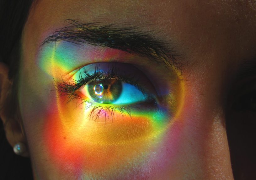


Colours are something that bring joy to pretty much everyone with a soul. If you don’t feel the same…I mean clearly you don’t have a soul. Sorry to break it to you like this. Now, while all colours are clearly joyful, some are simply just better than others. Here, I will present to you a definitive ranking of eleven colours, from worst to best. I don’t care if you consider them shades or don’t think they should be in the same list as some of our iconic rainbow colours; this is my article, not yours, so argue with the wall. Now I must preface this with a declaration: this is supposed to be fun. Maybe a little divisive if you’re really passionate about specific colours, but mainly fun. If you’re offended…check yourself back into preschool. This is about the colours of the rainbow, it’s obviously subjective, chill out. Alright, with that out of the way, let’s begin with the worst colour.
- Orange
Orange infuriates me. Period. And it’s not even a colour I see often (thankfully). I’m looking around my suite’s kitchen right now and I see one singular thing that’s orange, and it’s so brightly coloured that it pisses me off. Why is it so bright? Who gave it the audacity? Also, there’s literally no emotion I associate with orange. I mean, what is orange supposed to connect to? One of the only things I directly connect with the colour orange is the fruit which, like, yeah, I like oranges, but honestly thinking about the colour doesn’t inspire the same acidity and freshness the fruit provides. Alternatively, I’m reminded of pylons, but if I’m being wholly honest, that reminds me of my major, which makes my eye twitch so that’s not a great connection either. Monarch butterflies and sunsets are probably the only really nice orange things, but let’s be real, they only actually look good because there are other colours in their natural palettes. Hence, orange is trash and belongs in eleventh place. Moving on.
- Grey
Grey is the kind of colour that feels like I could touch it and it would be cold. That’s not what’s bad about it, that’s just something I feel like people should acknowledge. What’s bad about it is that grey is so solidly itself: it’s obnoxious. Like, genuinely the most depressing colour is probably grey. The world is so grey: buildings, objects, walls, the ground, and my class in STC that I spend 80% of my day in. Grey, grey, grey, grey, blah, blah, blah, bluegh. It’s just too much. And it reminds me of the fact that morality is grey and that I have responsibilities and problems. It’s overwhelming. No colour should remind me of the fact that I’m losing my mind on the daily (for legal reasons that’s a joke). Grey definitely does have its moments though. I mean, baby penguins? Pebbles? Cloudy skies? The moon? Those are all great grey things. But of course, those are all natural things that once again are highlighted by other colours. A grey world is not one I want to live in… but unfortunately I do and thinking about that is bringing back my eye twitch so let’s get on with the ranking.
- Yellow
I’ll generally say that yellow isn’t the most hideous thing (obviously, because orange is) as we are entering a more neutral and average territory for this colour ranking. Yellow is a cheerful colour, I’ll give it that. I generally associate it with wheat, cheese, and children’s colouring books; very average things. I also feel as though yellow fights back against the things of its colour that are bad, because sunflowers and sunshine carry this colour so hard. Plus, in the fall, when leaves are turning yellow, it can be so gorgeous. And of course, the iconic rubber duck? These are all phenomenal yellow things. But…it’s just so blinding. If I had to sit in a bright yellow room for an extended period of time, I feel like I’d wanna claw my eyes off and leave that circus-looking space. That’s another thing yellow reminds me of: circuses and clowns. And clowns are horrifying. On top of that, it reminds me of my high school uniform; bright mustard yellow and forest green. Yeah, I know, it was bad. And my locker was in the mustard yellow section so I got blinded by that stupid colour every morning. So yeah, the trauma is equivalent to all the positive things about yellow, so I physically can’t rate it higher.
8 . Pink
I struggled with where to put pink on this list because of the fact that it has some beautiful shades and has this delicate but powerful sense to it, but also has some of the absolute worst shades I’ve ever seen in my life. To put it plainly, pink is the kind of colour that can represent carnations and intestines simultaneously. It’s similar to yellow in this sense, where it has all those overwhelmingly awful shades, but I personally feel that the positives of pink outweigh its negatives whereas yellow does not have this attribute, hence solidifying the fact that pink is ranked higher. But no higher. Because I’m still picturing intestines. Not even cherry blossoms, Starbucks’ pink drink, or Barbie can beat that (even though it was a great movie).
- White
White is a clean slate, like a whiteboard, waiting to say something. I also associate white with a clean, fresh, and crisp state. I picture sparkling snowflakes, clouds, daisies, dandelions, and classical wedding dresses. However, as pretty as those wedding dresses are, the original concept of them being white gives me the ick. The other negative things I associate with white are mental asylums (with those padded walls) and hospitals. Both of those things really bring down white’s ranking as I associate mental asylums with horror movies and claustrophobia, and hospitals make me feel ill when I think about them. Overall, white tends towards positives, but definitely has a sickly undertone.
- Black
Here’s the thing. I understand that black is associated with dark morals, depression, nightmares, horror films, etc., but I feel like there’s much more nuance to the actual colour. The feeling I have attached to black isn’t anxiety or stress, it’s more stillness. I feel the sensation of laying in bed in the dark after a long day, feeling so comfortable and ready to sleep. I see mystery and elegance. I picture a blank blackboard, a dark sky waiting with anticipation to be filled with fireworks, a screen waiting to be lit up; I see potential. Black is like a clean slate, fresh with opportunity. Hence, black is sort of a middle of the road kinda colour; sorta scary, sorta comforting.
- Brown
Brown is where we turn towards colours that are definitely more good than bad. Brown, to me, is a reminder of freshly baked bread, cookies, and hot chocolate. There’s an earthiness to it; it’s grounding. I’m reminded of nature, the earth, fuzzy blankets, and the smell of coffee. Brown has a warmth to it that not many other colours can replicate. I feel like the colour could wrap me in a hug and it would be comforting, unlike if yellow or orange were to hug you… or rather, smother you. Brown also reminds me of the dark academia aesthetic, which embodies what I romanticize Waterloo to be (I know that romanticization is a bit of a stretch, but I’m trying my best here, you see the mental state I’m working with). Overall, brown is a pretty good colour.
- Red
Some of you may be wondering why red is so highly ranked, especially because of the fact that I’ve placed the other warm colours close to or at the bottom of this list. Well, that would be because of the fact that red has an amazing range. Anger? Covered. Love? Covered. Warmth? Covered. It’s all-encompassing. It reminds me of hearts and nail polish and strawberries. I picture cherries, Christmas, tulips, and even stop signs. Red is associated with so many things it’d be a disservice to rank it lower. Removing red from all the things it’s associated with and considering it more as a whole, we’re still left with such a passion-filled colour; so vibrant and expressive. It’s a strong and dynamic colour that is kinda like the leader of them all. But not the leader in rank because clearly, there’s an indisputable top three…
- Purple
Okay, so here’s the thing. Purple is my personal favourite colour. I love so many purple things. Purple flowers, for example, are absolutely top tier. Lavender fields? GORGEOUS. Lilac? Smells amazing and is so beautiful. Also, amethyst is such an iconic purple thing. Purple is just one of the prettiest colours! It has a sort of split dynamic in which it’s so elegant and mysterious and rich, but also welcoming and aesthetically pleasing and light. It symbolises royalty, luxury, and power. It’s just a phenomenal colour. So, you may ask, why is it only 3rd on the list? Well, while it’s my favourite colour and I have many things that are purple (with those things I own being either all dark or pastel purple), purple has some hideous shades. I love a lot of the different shades, but I draw the line at magenta and fuchsia. Holy, I hate those. With a passion. Hence, the low-ish rating. But still, I’d like to reiterate; purple is so awesome and gorgeous, and I love it so much.
- Green
GREEN. Green is such a good colour. It is so fresh and lively but also earthy and grounding. I’m reminded of forests and moss, cottagecore aesthetics, and Mother Nature. Green is just so welcoming and inviting. Also, there are some iconic green characters. Like, Mike Wazowski? Shrek? Kermit? Oscar the Grouch? Bulbasaur? Poison Ivy? The Tooth Fairy (from Rise of the Guardians obviously)? LUIGI? It’s wild how green is just so all-embodying it can make me simultaneously feel like I’m in a Studio Ghibli scene but also Shrek’s swamp. In all seriousness, green is the colour that makes me feel the opposite of how grey does. It’s the colour of life, and makes me feel a sense of relief and space. It’s amazing. In fact, only one colour beats it.
- Blue
This is probably the easiest decision I’ve ever had to make. I mean, come on. Blue is a phenomenal colour that has barely any bad shades and can represent so many emotions. Blue is a reminder of the ocean and the sky, delphiniums and bluebells, and the rain and sapphires. And while blue is a reminder of these beautiful things, it also evokes feelings of freedom and relief. Even when it’s linked with sadness, blue is a colour that can be delicately comforting. And while it is extremely delicate at times, it’s also rich and filled with depth. Blue is the kind of colour that makes me want to go outside. It’s also a colour I link to art and music. When I think of blue I think of Robert Julian Onderdonk’s Dawn in the Hills, and “I Think I Like When It Rains” by WILLIS. Also “Atlantis” by Seafret. It’s just a colour I connect with so strongly. So…blue is clearly the best colour – beautiful, all-encompassing, emotive, powerful, and delicate.
There you have it. A definitive ranking of all eleven colours. We have some clear winners and losers, and some that are just in the middle of the road. If you disagree with my ranking…I don’t particularly care, but I’m down to debate. I look forward to you losing!
Image Citation
[1] Rainbow Eye Visual. Contexis, 2023.
(Link to Image: https://www.contexis.com/)
Leave a Reply